How to create a professional email signature?
 You've spent an hour crafting the perfect email. The subject line is clear. The body is concise and persuasive. You hit send — and the recipient's last impression is a jumbled block of text with three phone numbers, a motivational quote, a legal disclaimer that's longer than the email itself, and a blurry company logo from 2019.
Your email signature is the last thing people see in every email you send. It's your digital business card, your professional footer, your closing impression — repeated hundreds of times a week. And most people either overthink it into a cluttered mess or underthink it into nonexistence.
Here's how to get it right.
What your signature actually needs
A professional email signature has exactly the information someone needs to identify you, contact you, or learn more — and nothing else. Here are the essential elements:
Your full name. Not a nickname, not initials. The name you use professionally.
Your job title. Keep it concise. "Senior Product Designer" works. "Senior Product Designer, Innovation & User Experience, Digital Products Division" doesn't. If your official title is unwieldy, use the version people actually understand.
Your company name. Link it to your company website. This turns every email into a subtle brand touchpoint.
One phone number. Your primary business number. Not three numbers for different contexts. One.
One link. Your company website, your LinkedIn, or your portfolio — whichever is most relevant to your professional identity. Not all three. One.
That's it. Five elements. Everything else is optional and should be added only with clear justification.
The clean template
—
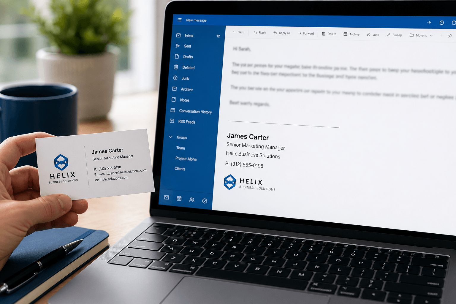
Sarah Chen
Product Lead, Acme Corp
+1 (555) 234-5678
acmecorp.com
Clean. Scannable. Professional. The em dash (—) or a simple horizontal line separates the signature from the email body. The name is bold so it stands out. Everything else is plain text. This format works in every email client, on every device, in every context.
What to add (carefully)
Beyond the essentials, some additions can be valuable — if used judiciously:
Company logo: Only if it's clean, small (under 100px tall), and adds visual identity. A blurry, oversized, or outdated logo is worse than no logo. Ensure it displays correctly on both light and dark backgrounds.
Pronouns: Increasingly common and appreciated in professional settings. Keep them on the same line as your name: "Sarah Chen (she/her)."
Social links: One or two, maximum. LinkedIn is almost always appropriate for professionals. Twitter/X if you're in media, tech, or public-facing roles. Use small icons rather than full URLs — "linkedin.com/in/sarahchen" is cleaner as a linked icon.
A call to action: If relevant — "Book a meeting" linked to your calendar, or "Download our latest report." This works well for sales, consulting, and client-facing roles. Change it periodically to keep it fresh.
Credentials or certifications: Only if they're directly relevant and recognized. "CPA" for an accountant, "PE" for an engineer, "MD" for a doctor. Skip the alphabet soup of minor certifications that recipients won't recognize.
What to leave out
Motivational quotes. "Be the change you wish to see in the world" at the bottom of a budget approval email is jarring. Quotes feel personal on the first read and annoying by the tenth. They don't add professional value and they increase visual clutter.
Legal disclaimers (unless legally required). Many companies add multi-paragraph confidentiality notices to every email. If your legal team mandates it, comply. If it's optional, skip it — these disclaimers are rarely enforceable and nobody reads them. They just make your emails longer.
Animated GIFs or complex HTML. What looks good in Gmail might render as a broken mess in Outlook. Animated elements are distracting, increase email size, and can trigger spam filters. Professional email isn't the place for design experimentation.
Multiple phone numbers. Office, mobile, fax (?), WhatsApp — pick one. The more numbers you list, the less likely anyone is to call any of them. If someone needs a different number, they'll ask.
"Sent from my iPhone." This default signature tells the recipient nothing useful and subtly apologizes for typos in advance. Replace it with your actual signature or remove it entirely.
Banner images or promotional graphics. Unless you're in marketing and deliberately using your signature as ad space, banner images are visual noise. They increase email size, often don't render on mobile, and look like advertisements rather than professional communication.
Formatting rules
Use no more than two fonts. One for your name (slightly larger or bold), one for everything else. Sans-serif fonts (Arial, Helvetica, Inter) render consistently across email clients.
Use no more than two colors. Your name or company name in a brand color, everything else in dark gray or black. Rainbow signatures scream unprofessional.
Keep it under 4 lines of text. A signature taller than the email body itself is a problem. If your signature requires scrolling, it's too long.
Test on mobile. Over 60% of emails are opened on phones. What looks perfectly formatted on your 27-inch monitor might overflow, wrap awkwardly, or become unreadable on a 6-inch screen. Send yourself a test email and check it on your phone before deploying.
Use plain text where possible. HTML signatures with images and complex formatting can trigger spam filters, display inconsistently across clients, and increase email file size. A clean plain-text signature with a single small image (logo, if needed) is the safest approach.
Signatures for different contexts
For corporate professionals:
—
James Okafor
Director of Engineering, TechCorp
+44 7700 123456 · techcorp.com
For freelancers/consultants:
—
Maria Santos
Brand Strategy Consultant
mariasantos.com · Book a call
For founders/startup:
—
Alex Kim, Co-founder
Lighthouse · lighthouse.app
We're hiring → lighthouse.app/careers
For job seekers:
—
Priya Mehta
Product Designer · Portfolio
+1 (555) 678-9012 · LinkedIn
For executives (CFO, VP, C-suite):
—
David Park
Chief Financial Officer, Meridian Group
+1 (212) 555-0190 · meridiangroup.com
At the executive level, keep it especially sparse. No certifications list, no social links. The title carries the weight — let it.
For accountants and finance professionals:
—
Rachel Torres, CPA
Senior Accountant, Torres Financial
+1 (415) 555-7823 · torresfinancial.com
Put recognized credentials (CPA, CFA, CFP) directly after your name, not in a separate line — it reads more naturally and keeps the signature compact.
Notice the pattern: every example is 3-4 lines, uses one or two links, and tells you exactly who this person is and how to reach them.
When you have multiple titles or roles
If you hold more than one role — co-founder and head of sales, consultant and advisor, board member and investor — the temptation is to list everything. Resist it.
Pick the single most relevant title for the context. Sending a business development email? Use your BD title. Writing as a board member? Use that. You can have multiple signature variants set up in your email client and choose the appropriate one.
If both roles genuinely matter to the recipient, combine them on one line:
Alex Nguyen, Co-founder & CTO
Luminary · luminary.io
The comma-separated format keeps it readable without a long title line. More than two combined roles in a signature looks like a resume, not a professional footer.
How to set it up
Gmail: Settings → See all settings → General → Signature. You can create multiple signatures and assign different ones to different email addresses or compose vs. reply.
Outlook: Settings → Mail → Compose and reply → Email signature. Supports multiple signatures and HTML formatting.
Apple Mail: Preferences → Signatures → Create new. Supports rich text and images. Each email account can have its own default signature.
Tip: Create two versions — a full signature for new conversations and a shorter one for replies (just your name and phone number). Most email clients support setting different signatures for "new emails" vs. "replies/forwards." This prevents your full signature from appearing 12 times in a long thread.
Your signature reflects your professionalism
Think of your email signature as the final handshake at the end of every conversation. It should be firm, clean, and memorable for the right reasons. Not cluttered, not flashy, not apologetic.
The irony is that the best email signatures are the ones you barely notice — they provide the information you need and get out of the way. Just like the best email experience itself should be: organized, intelligent, and respectful of your attention. That's exactly the philosophy behind Faraday — an email client that handles the organizational complexity so every interaction, from subject line to signature, stays focused on what matters.